
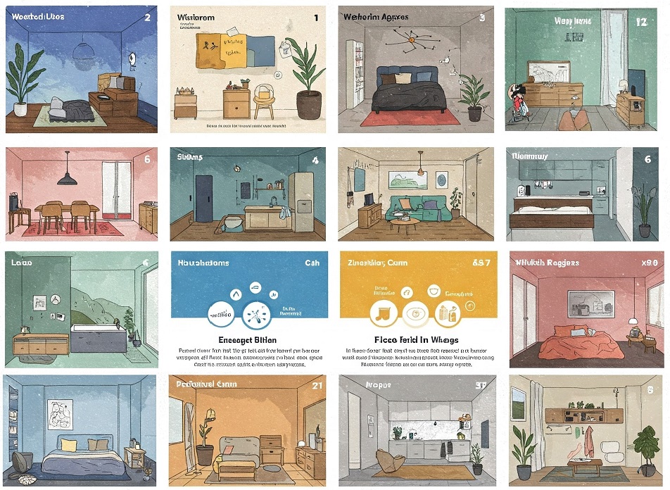

Color psychology is a field that studies how colors affect human emotions, thoughts, and behaviors. Historically, societies like Egyptians and Chinese used colors for healing and spiritual practices. Today, it’s a refined discipline in interior design, allowing designers to create spaces that encourage relaxation, focus, and creativity by understanding and leveraging these insights.
For homeowners embarking on renovation projects, integrating color psychology requires more than selecting favorite hues—it necessitates a deliberate approach. By employing high-quality painting services, the precision of color application can be guaranteed, ensuring that chosen shades not only align aesthetically with the homeowner’s vision but also enhance the psychological ambiance of the home. This professional guidance ensures a flawless finish, bringing the psychological benefits of color to the forefront in every room.
The Role of Color in Interior Spaces
Colors serve a multifaceted role in interior design, influencing a space’s perceived and functional characteristics. When used thoughtfully, colors can transform the atmosphere, affecting how rooms are experienced. Light colors, such as gentle whites and soothing pastels, can make small or dimly lit rooms appear larger and more open by reflecting light. This illusion of expanded space creates an inviting and airy feel, often essential in urban living scenarios where space is at a premium.
Conversely, darker hues introduce depth and intimacy, fostering a warm, cozy atmosphere that suits private retreats like bedrooms or dens. The perception of color is intricately linked to lighting conditions, as natural daylight reveals a color’s authentic tones, while artificial lighting can shift and alter them. Understanding the interaction between light and color is critical when selecting a palette, as light variations can transform a space’s intended mood throughout the day.
Moreover, color can strategically guide movement and focus within a room, subtly directing attention to architectural features or focal points. Accent walls in bold or contrasting hues can energize a space and create visual interest without overwhelming the entire room. Color psychology significantly influences interior design, with blues and greens evoking calmness and productivity and yellows and reds stimulating energy and conversation. A cohesive color scheme, aligned with each space’s purpose and emotional tone, enhances functionality and comfort, elevating aesthetics and supporting the environment’s ambiance.
Popular Colors and Their Psychological Effects
Every color carries distinctive psychological connotations, shaping a room’s ambiance and emotional experiences. Blue, known for its calming and stable qualities, is often chosen for relaxing areas like bedrooms and home offices. Its cooling tones create an environment that reduces stress and supports concentration, making it ideal for fostering a productive yet serene atmosphere.
Yellow, emblematic of sunshine, radiates energy and positivity, lending itself perfectly to kitchens and dining rooms where an invigorating and welcoming environment enhances the culinary and dining experience. In contrast, green invokes natural tranquility and balance, linking interior spaces to the peacefulness of nature. Its presence in living areas and wellness spaces supports rejuvenation and harmony, promoting a sense of renewal and vitality.
Meanwhile, with its bold and passionate energy, red is best used as an accent color to stimulate conversation and evoke warmth in social spaces like living rooms or entryways. Purple, often associated with luxury and creativity, brings an air of sophistication and introspection, making it an intriguing choice for artistic studios or reading nooks. Neutrals like beige, gray, and taupe are versatile foundations that balance bolder tones or create minimalist, calming environments. Thoughtfully integrating these psychological influences ensures each room looks appealing and aligns with its intended emotional function.
Choosing Colors for Different Rooms
Selecting the right color scheme for each room involves considering its purpose and the emotions the space is intended to invoke. In active areas like kitchens, vibrant and energetic colors like red and orange can stimulate conversation and enhance appetites, creating lively and dynamic settings. Bedrooms, as havens of rest, benefit from cooler, restful colors like pale blues and soft mauves, cultivating relaxation and easing the transition into sleep. Living rooms in a home can be adorned with bold and subtle colors to create a welcoming atmosphere. This harmonious design enhances the fluidity and unity of the home’s aesthetic vision, making each room a focal point.
Bathrooms often benefit from serene hues like soft greens, gentle greys, or aqua tones, which evoke a sense of cleanliness and spa-like tranquility. Home offices may incorporate muted blues or earthy neutrals to encourage focus and minimize distractions while maintaining a comfortable atmosphere. Entryways, which form the first impression of a home, can feature welcoming tones like warm taupe or cheerful yellows to set an optimistic and inviting tone. Accent walls or decor pieces allow for playful pops of color without overwhelming a room, offering flexibility to update the space easily. Ultimately, thoughtful color coordination between rooms can enhance emotional comfort and visual continuity, enriching the living experience.
Trends in Home Color Design
Current trends in home color design often reflect broader societal and cultural tendencies. There is a growing inclination towards earthy tones and muted palettes that express sustainability and environmental consciousness. These color choices highlight a return to nature, fostering serenity and balance in living spaces. They underscore a shift toward simplicity and mindfulness, aligned with artisan and eco-friendly design philosophies prioritizing comfort and sustainability.
The concept of “scenic comfort” aligns with these trends, as homeowners choose palettes that inspire warmth and security, creating interiors that nurture emotional well-being. Such deliberate choices in color result in a home atmosphere that reflects the inhabitants’ values, fostering visual appeal, holistic wellness, and fulfillment.
This trend also sees an increasing appreciation for warm neutrals, such as clay, sand, and terracotta, which evoke a grounded, timeless quality. Soft greens and ocean-inspired blues are becoming popular for their calming effects, connecting interior spaces with outdoor landscapes. Additionally, color blocking with complementary muted hues makes waves, offering a modern yet understated aesthetic that avoids overwhelming the senses. The influence of global cultures is also evident, with rich, nature-derived tones like ochre and deep forest green gaining favor for their depth and storytelling ability. Overall, these trends signify a collective desire for homes that look beautiful and feel restorative and meaningful.
Tips for Selecting Paint Colors
Selecting paint colors is an art that thoughtfully combines personal style with practical considerations. To choose colors confidently, it is effective to apply test samples on walls and observe them under various lighting conditions throughout the day. This method reveals how colors adapt to different times, avoiding surprises once a color is applied across an entire room.
In addition to considering light, the interaction of new colors with existing furniture, floors, and decor contributes significantly to achieving a coherent look. When in doubt, consulting color experts or using digital visualization tools can be invaluable. These resources provide previews and suggestions, ensuring a balanced, harmonious palette that fulfills decorative and emotional needs.
Undertones also play a crucial role—what may appear as a neutral gray could carry hints of blue, green, or purple, which might clash or harmonize with surrounding elements. Paying attention to finishes—matte, satin, or gloss—can affect how the color appears and wears over time, especially in high-traffic areas. Neutral backdrops allow for more flexibility in future decor changes, while bold accent walls can add personality without overwhelming the space. It’s also important to consider the emotional tone of each room and how color influences mood and functionality. A successful color selection ultimately enhances aesthetic appeal and livability, turning a house into a personalized, cohesive home.
Common Mistakes to Avoid in Color Selection
Inevitable common mistakes can derail the intended impact of color choices in a home. Overusing bold colors can lead to an overwhelming sensory experience, detracting from a space’s comfort and intended effect. Achieving balance is essential, as juxtaposing vibrant hues without thoughtful consideration can strain the eye and create discord.
Another pitfall is neglecting the coherence of color flow from room to room. While individual spaces can showcase different colors, maintaining an overarching thematic link throughout the home enhances its cohesive feeling, integrating each room as part of a greater whole. This strategy optimizes aesthetic harmony and elevates the overall satisfaction of living in a visually connected environment.
Ignoring the influence of natural and artificial lighting can also result in unexpected color outcomes, causing tones to appear drastically different from what was envisioned. Additionally, failing to consider how paint finishes interact with color can alter perception—glossy surfaces reflect more light, amplifying brightness. In contrast, matte finishes offer a softer, more subdued look. Being mindful of these nuances allows more accurate execution of your design vision and prevents costly repainting or dissatisfaction.