


Painting your house interior is one of the most exciting and creative ways to express your personality, set the mood, and make your home feel fresh and beautiful. But with thousands of paint colors and schemes available, deciding which combination works best for your space can feel overwhelming. There are practical, psychological, and aesthetic factors to consider when making your decision.
Statistics show that homeowners who carefully select paint schemes for their interiors can increase their home’s perceived value by up to 5% (Zillow, 2018). Yet, personalizing your space goes beyond just value; it influences how you feel in your environment, how you entertain guests, and how the house feels like “home.”
In this article, we will explore several angles that can help you navigate the world of interior paint schemes with ease. We will dive deep into the importance of color psychology, trending palettes, expert opinions, and practical tips for choosing colors that not only look great but feel right.
Understanding the Basics: The Importance of Color in Home Design
Color plays a vital role in interior design and affects how spaces feel. Certain colors can make a room feel larger, cozier, warmer, or cooler. They can influence moods—calming the mind or energizing a space. According to research from the University of Winnipeg, color psychology suggests that colors can impact human emotions and behavior (Simmons, 2019).
When choosing a paint scheme for your house interior, it’s important to understand how different colors affect the perception of your space. For example:
- Light colors like white, cream, and pastels can make a small room feel larger.
- Warm colors such as reds, oranges, and yellows tend to make spaces feel cozy, but may also make them feel smaller.
- Cool colors like blues, greens, and purples are generally calming and can make a room feel more open.
- Neutral colors such as grays, beiges, and taupes offer flexibility and sophistication, giving you a clean slate to work with other elements like furniture and accessories.
While choosing colors based on these general effects is useful, personal taste also plays a big role. You want a paint scheme that not only looks good but feels comfortable and aligned with your personality.
Current Trends in Interior Paint Schemes
Interior paint trends are constantly evolving, and staying updated can help you make informed decisions. Popular trends for 2024 reveal a shift toward organic, earthy tones as well as bold, contrasting colors. According to Pantone, one of the leading color authorities, soft shades of green, dusty pinks, and earthy terracottas are among the most popular choices this year.
But trends shouldn’t be followed blindly. Just because something is “in” doesn’t mean it will work for your space. Here’s why:
- Room function: Bright yellows or deep reds might be trendy, but they’re not the best choice for spaces where relaxation is important, such as a bedroom.
- Personal style: If a trending color doesn’t resonate with your personal style, it could clash with the rest of your décor and furnishings.
- Lighting conditions: Colors may look very different depending on natural and artificial lighting. Always test paint swatches in different lighting situations before committing.
Experts like Kelly Wearstler and Joanna Gaines often recommend neutrals as a base. Neutral colors like soft grays, whites, and light browns are timeless and offer a blank canvas for experimenting with accents. This makes it easier to adapt your interior style over the years without having to repaint entire rooms.
Color Psychology in Interior Design: How Different Hues Affect Your Mood
The concept of color psychology is deeply embedded in how we design homes. Certain hues evoke specific emotional responses, which is why interior designers often stress the importance of choosing colors that align with how you want each room to feel.
- Blue: Known for its calming and serene qualities, blue is a popular choice for bedrooms and bathrooms. Studies suggest that blue can lower blood pressure and heart rate, making it ideal for creating a tranquil space (Kurt, 2021).
- Yellow: This bright, cheerful color brings energy to any room. It’s often used in kitchens and dining areas, as it can stimulate the appetite and encourage social interaction.
- Red: A bold, passionate color that raises energy levels, red is commonly used in dining rooms or as an accent wall. However, too much red can feel overwhelming in bedrooms or living spaces.
- Green: Associated with nature, green is restful and refreshing. It’s a versatile color that works well in living rooms, kitchens, and bedrooms and is particularly popular in modern, eco-friendly designs.
- Gray: The epitome of neutrality, gray creates a sophisticated and calm environment. It has the versatility to pair with almost any accent color, making it a favorite for homeowners looking for flexibility.
- Purple: Historically associated with royalty, deep shades of purple create a sense of luxury and drama, while lighter lilacs and lavenders promote tranquility.
Choosing colors that align with how you want to feel in each room is critical. For example, a bright yellow living room might feel inviting in the morning but could become overwhelming at night. Conversely, a bedroom painted in dark, calming tones might help with better sleep quality.
Popular Paint Schemes for Different Rooms
Different rooms in your home serve different purposes, and your choice of paint scheme should reflect these functions. Let’s look at some popular interior paint schemes for specific rooms in the house.
Living Room: As one of the most frequently used spaces in a home, the living room is where you can experiment with color without being too daring. Neutral tones like beige, gray, or greige (a mix of gray and beige) are popular choices as they allow for versatility in décor. Adding accent walls in bolder shades like navy blue or deep green can add depth without overpowering the space.
Kitchen: White kitchens are a classic choice, but recent trends favor adding color with cabinets or feature walls. Light grays, soft blues, or muted greens can make a kitchen feel warm and inviting. The key is to strike a balance between a clean look and adding personal touches through color.
Bedrooms: Bedrooms should feel peaceful and restful. Cool colors like soft blues, greens, or even blush pinks are soothing choices for this space. Darker tones like charcoal or navy can add coziness, especially when paired with lighter bedding and accessories.
Bathrooms: Light, airy colors are ideal for bathrooms. Whites, soft pastels, and light grays create a sense of cleanliness and space. If you want to make a statement, using darker hues like deep green or navy in small doses, such as for cabinetry or feature walls, can create a stylish contrast.
Home Office: With more people working from home, the home office has become an important space to consider. Colors like light blues, grays, or soft greens are great for fostering focus and calm. Avoid overly stimulating colors like bright reds or oranges, which can cause distraction.
Related: What are Safari Colors? Unraveling the Beauty of Nature
The Power of Accent Walls
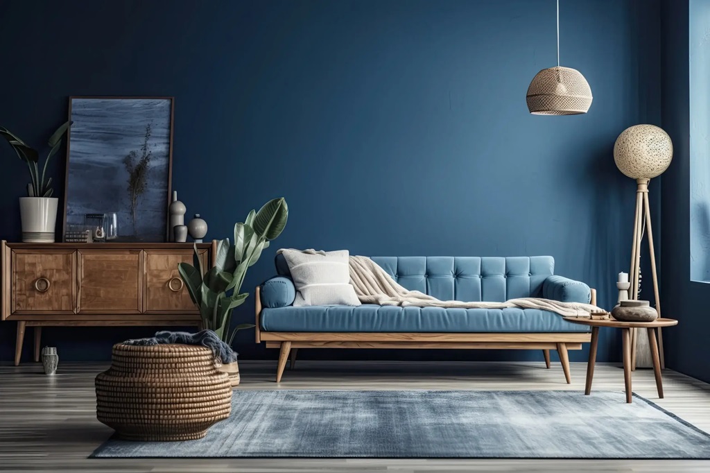
An accent wall can be a powerful design feature in any room, drawing attention and breaking up monotony without overwhelming the space. Accent walls allow you to play with bolder colors without committing to painting an entire room.
There are a few key guidelines when creating an accent wall:
- Choose the right wall: Typically, accent walls are used on walls with a natural focal point, such as a fireplace, large window, or bed frame.
- Keep the rest of the room neutral: A bold accent wall works best when the other walls in the room are painted in neutral tones. This ensures that the accent wall stands out without clashing.
- Use complementary colors: Your accent wall color should complement the rest of the room’s décor. For example, if your furniture is mostly neutral, you can opt for a bolder color like deep blue or emerald green on the accent wall.
Using accent walls strategically is a budget-friendly way to add personality and flair to your home without committing to painting an entire room in a bold color.
Paint Finishes and Their Impact on Aesthetics
Choosing the right paint finish is just as important as selecting the right color. Different finishes create different textures and affect how light reflects off your walls. The most common types of paint finishes include:
- Matte: Also known as flat paint, matte finishes have no shine and are best for low-traffic areas like bedrooms or living rooms. They hide imperfections well but are less durable and harder to clean.
- Eggshell: Slightly more reflective than matte, eggshell is a popular choice for living rooms and hallways. It offers a smooth finish and is easier to clean than matte paint.
- Satin: Satin has a soft sheen and is more durable, making it a good choice for kitchens, bathrooms, and high-traffic areas.
- Semi-gloss: Semi-gloss is highly durable and moisture-resistant, making it ideal for bathrooms, kitchens, and trim work. It has a noticeable sheen that reflects light and creates a bright, clean look.
- Gloss: The most reflective finish, gloss is often used for trim, doors, and cabinets. It’s durable and easy to clean but can highlight imperfections on the wall surface.
The finish you choose should depend on both aesthetic preferences and practical needs. For example, if you have young children or pets. A satin or semi-gloss finish may be easier to clean and maintain in high-traffic areas.
How Lighting Affects Paint Colors
One crucial aspect that many homeowners overlook when choosing interior paint schemes is lighting. Both natural and artificial light can dramatically affect how a paint color looks on your walls.
- Natural light: Rooms that receive plenty of natural light tend to show colors more accurately. In spaces with lots of sunlight, you can afford to use cooler or darker tones without making the room feel too dim. However, rooms with limited natural light might benefit from lighter, warmer shades to compensate for the lack of brightness.
- Artificial light: Different types of light bulbs emit different tones. Incandescent bulbs produce a warm, yellowish glow, while LED and fluorescent bulbs emit cooler, more blue-toned light. Test paint swatches under the lighting conditions that you’ll be using most often in the room before making your final choice.
Considering how your paint choices will look under different lighting conditions can help you avoid surprises once the paint is on the walls.
The Role of Paint Schemes in Open-Plan Homes
Open-plan homes, which are becoming increasingly popular, present unique challenges when it comes to choosing paint schemes. With fewer walls to separate rooms, it’s important to create a sense of cohesion without making the space feel monotonous.
One solution is to use different shades of the same color throughout the space. For example, you could paint the kitchen a soft gray, the dining area a slightly darker gray, and the living room a neutral off-white. This creates subtle transitions between spaces without jarring color changes.
Another approach is to use a single neutral color on the walls and add variety through furniture, artwork, and accessories. This allows the space to feel cohesive but with enough variation to keep it interesting.
Eco-Friendly Paint Options for Healthier Homes
In recent years, there has been a growing demand for eco-friendly, non-toxic paint options. Many conventional paints contain volatile organic compounds (VOCs) that can release harmful chemicals into the air, negatively affecting indoor air quality. Low-VOC and zero-VOC paints are now widely available, offering homeowners a safer alternative.
Eco-friendly paints are not only better for your health but also better for the environment. They are typically made from natural ingredients, reducing the carbon footprint of your home improvement project.
When selecting eco-friendly paints, look for certifications from organizations such as GreenGuard or LEED, which ensure that the paint meets environmental and health standards.
Professional vs. DIY: Which is the Best Approach?
One of the most common questions homeowners face when deciding to repaint their interior is whether to hire a professional or tackle the job themselves. There are pros and cons to both approaches.
- Professional painters: Hiring a professional ensures high-quality work and can save you time and effort. Professionals have access to the best tools and techniques, and they can often complete the job more quickly than a DIY project. On the downside, hiring a pro can be expensive, especially for large projects.
- DIY painting: If you’re working on a tight budget, painting your home’s interior yourself can be a cost-effective solution. DIY painting allows for more control over the process, but it can also be time-consuming and physically demanding. Additionally, achieving a professional finish may require practice, especially when it comes to details like trim and edges.
The choice between professional and DIY painting depends largely on your budget, experience level, and the scope of your project. For smaller rooms or accent walls, DIY may be a viable option. For larger, more complex projects, hiring a professional might be worth the investment.
Conclusion
Choosing the right paint scheme for your house interior is more than just a matter of aesthetics. It’s about creating a space that feels welcoming, reflects your personality, and serves the practical needs of each room. From understanding color psychology to staying updated on current trends. The decisions you make when selecting paint colors can have a lasting impact on your home’s look and feel.
By considering the factors discussed in this article, including room function, lighting, and paint finishes. You can confidently choose a paint scheme that enhances your home and elevates your living experience.